The Mezmo blog
Browse by topic
Active Telemetry
Active Telemetry
Agentic Observability
Agentic Observability
AI Agent Infrastructure
AI Agent Infrastructure
Alerting & Incident Response
Alerting & Incident Response
AURA
AURA
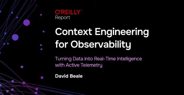
Context Engineering
Context Engineering
Developer Tools & Workflows
Developer Tools & Workflows
DevOps Insights
DevOps Insights
Integrations
Integrations
Logging Best Practices
Logging Best Practices
Observability Cost Control
Observability Cost Control
Observability Strategy
Observability Strategy
OpenTelemetry (OTel)
OpenTelemetry (OTel)
Platform Observability
Platform Observability
Production AI Observability
Production AI Observability
Product Updates
Product Updates
Root Cause Analysis
Root Cause Analysis
Security & Compliance
Security & Compliance
Site Reliability Engineering (SRE)
Site Reliability Engineering (SRE)
Telemetry for AI Agents
Telemetry for AI Agents
Telemetry Pipeline
Telemetry Pipeline
Thought Leadership
Thought Leadership
Recent posts
Builder in the loop: what production agents were missing before AURA
Builder in the loop: what production agents were missing before AURA
AURA engineer Mike Shearer explains why production agents need persistent context, server-side execution, orchestration, and measurable evaluation.
.png)
5 Things to Know About Context Engineering
5 Things to Know About Context Engineering
Context engineering helps SREs and AI agents reason over telemetry by designing structure, lineage, and intent into every signal for modern operations.
An SRE agent for production
An SRE agent for production
AURA is Mezmo's open-source SRE agent that runs in your infrastructure to investigate incidents, ground findings in real telemetry, and keep actions reviewable

Builder in the loop: Tony Rogers on stress-testing AURA before production
Builder in the loop: Tony Rogers on stress-testing AURA before production
Tony Rogers explains how Mezmo tests AURA with internal benchmarks, trace inspection, and workflow validation to make agentic SRE reliable before production
.png)
Builder in the loop: Eric Lake on making AURA smarter after every incident
Builder in the loop: Eric Lake on making AURA smarter after every incident
Mezmo SRE Eric Lake connected AURA to GitHub runbooks via MCP, auto-generates missing ones, and stores investigation memory across incidents.
.png)
Why SRE agents need orchestration, not just more tools
Why SRE agents need orchestration, not just more tools
Single SRE agents hit a ceiling fast. See how AURA's orchestration mode routes work across scoped agents to cut tool overload and context confusion.

When your agents hallucinate at 2 AM, it is not a model problem
When your agents hallucinate at 2 AM, it is not a model problem
Context engineering is the deliberate design of telemetry, metadata, and feedback loops so AI agents reason accurately over production systems during incidents

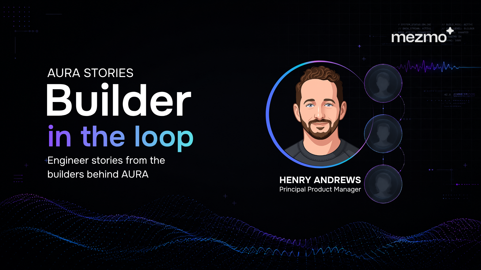
Builder in the loop: Henry Andrews on building AURA like production software
Builder in the loop: Henry Andrews on building AURA like production software
Mezmo PM Henry Andrews on why AURA uses Rust, TOML configs, and OpenTelemetry to make MCP-native agent workflows inspectable and production-ready for SRE teams.
We built an SRE bot on AURA. Here's what we learned.
We built an SRE bot on AURA. Here's what we learned.
We put AURA behind a Slack bot, connected it to PagerDuty, Prometheus, and Mezmo via MCP, and pointed it at our own production environment. Here's what worked.
The journey to production AI: Five steps for SRE and platform teams
The journey to production AI: Five steps for SRE and platform teams
56% of teams have zero agents in production. The five steps that move SREs and platform engineers from agent demo to autonomous ops with AURA and Mezmo.

The runbook problem: How AURA documents what teams don’t have time to write
The runbook problem: How AURA documents what teams don’t have time to write
Learn how AURA helps SRE and platform teams turn incident investigations into draft runbooks using grounded context, MCP tools, and human review.

AURA in practice: real-world use cases for production AI agent infrastructure
AURA in practice: real-world use cases for production AI agent infrastructure
Explore six production use cases for AURA, Mezmo's open-source, MCP-native agent harness, from drop-in chat agents to runbook-grounded RCA.

Why we open-sourced AURA: Infrastructure for production AI
Why we open-sourced AURA: Infrastructure for production AI
AURA was built to be an open-source standard for production AI, designed to connect your models so you can trust what you see.

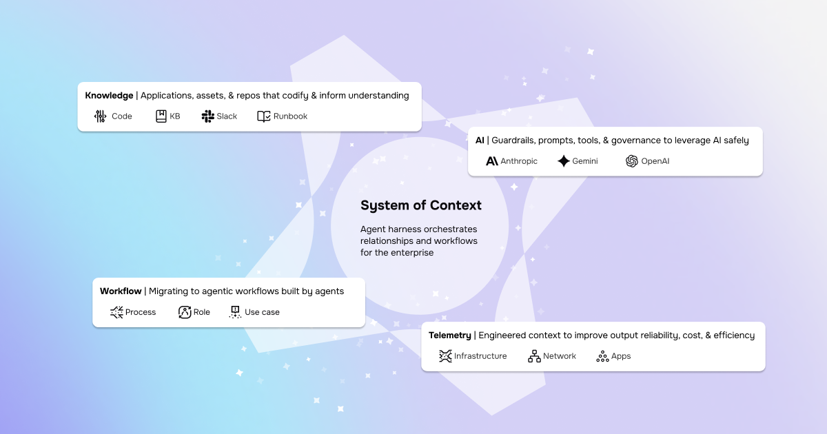
Life after SaaS: Enabling the System of Context
Life after SaaS: Enabling the System of Context
SaaS is changing for the better. Now, organizations can build, deploy, and scale faster than ever — it’s our job to provide the System of Context.
The Grok-to-AI evolution: Why modern SREs are moving beyond manual parsing
The Grok-to-AI evolution: Why modern SREs are moving beyond manual parsing
Grok Patterns are reactive. Real evolution is shifting from manual parsing to AI-assisted systems for improved understanding and observability.

Take back control of your observability spend
Take back control of your observability spend
Take back the power and control of your observability strategy. With OpenTelemetry and Mezmo, break free from vendor lock-in and cut your costs today.

AI SRE update: Your feedback shaped our latest release
AI SRE update: Your feedback shaped our latest release
The latest Mezmo AI SRE update adds streaming progress, log aggregation, and visualization tools to make observability faster and more intuitive.
.png)
Simplify the collection layer and move to OTel without the agent sprawl
Simplify the collection layer and move to OTel without the agent sprawl
Don’t let legacy agents cause problems during your OpenTelemetry migration. Mezmo makes migrating to OpenTelemetry and unlocking the true potential of AI easy.

New year, new telemetry: Resolve to stop breaking dashboards
New year, new telemetry: Resolve to stop breaking dashboards
Stop the migration headaches. Learn how to transition to OpenTelemetry in 2026 using a telemetry pipeline to maintain existing dashboards and reduce costs.

The Observability stack is collapsing: Why context-first data is the only path to AI-powered root cause analysis
The Observability stack is collapsing: Why context-first data is the only path to AI-powered root cause analysis
More dashboards haven't cut MTTR. See why context-first data is the only path to AI-powered root cause analysis that lowers tokens and cost.
.jpg)
Mezmo + Catchpoint deliver observability SREs can rely on
Mezmo + Catchpoint deliver observability SREs can rely on
Mezmo and Catchpoint pair internal telemetry with external performance insight and agentic SRE analysis to surface real root causes and shrink MTTR.

Mezmo’s AI-powered site reliability engineering (SRE) agent for root cause analysis (RCA)
Mezmo’s AI-powered site reliability engineering (SRE) agent for root cause analysis (RCA)
Mezmo's new AI SRE agent is here. Get instant root cause analysis, 90% faster MTTR, and proactive observability, included in your subscription at no extra cost.
What is Active Telemetry
What is Active Telemetry
Active Telemetry turns logs, metrics, and traces into AI ready signals in real time to cut noise, reduce spend, speed MTTR, and enable agentic ops.
Launching an agentic SRE for root cause analysis
Launching an agentic SRE for root cause analysis
Mezmo’s AI SRE delivers root cause analysis fast with agentic workflows, Active Telemetry, and an MCP Server, cutting costs by 90% and MTTR by up to 80%.

Paving the way for a new era: Mezmo's Active Telemetry
Paving the way for a new era: Mezmo's Active Telemetry
Discover Mezmo's Active Telemetry—a proactive approach that delivers real-time, high-fidelity data developers, SREs, and AI agents need to move faster.
The answer to SRE agent failures: Context Engineering
The answer to SRE agent failures: Context Engineering
AI SRE agents overpromise but underdeliver due to missing context. Learn why raw telemetry breaks them — and how Mezmo’s Context Engine fixes it

Empowering an MCP server with a telemetry pipeline
Empowering an MCP server with a telemetry pipeline
AI agents are only as good as their context. Learn how Mezmo's telemetry pipeline supplies the real-time data that powers AI-driven observability.

The debugging bottleneck: A manual log-sifting expedition
The debugging bottleneck: A manual log-sifting expedition
Skip the manual log hunt. The Mezmo MCP Server delivers context-rich data to AI agents, enabling instant root cause analysis and proactive workflows.

The smartest member of your developer ecosystem: Introducing the Mezmo MCP server
The smartest member of your developer ecosystem: Introducing the Mezmo MCP server
Eliminate tool friction and boost productivity. The Mezmo MCP Server delivers seamless access to observability data across your dev ecosystem.

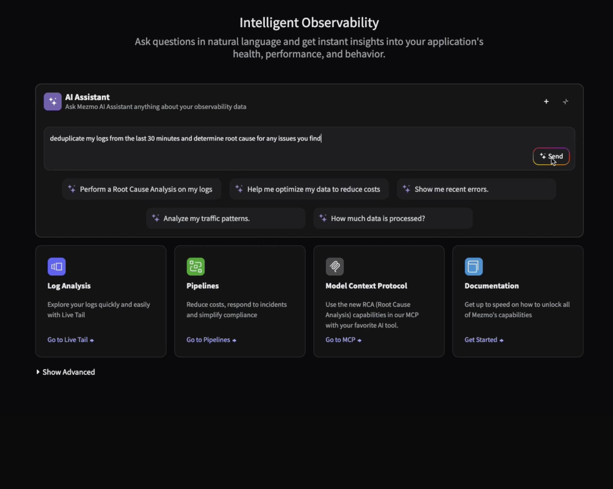
Your new AI assistant for a smarter workflow
Your new AI assistant for a smarter workflow
Boost efficiency with Mezmo’s new AI chatbot. Get instant answers, context-aware help for pipelines, and smarter workflows, all directly in the platform.
The observability problem isn't data volume anymore—It's Context
The observability problem isn't data volume anymore—It's Context
Engineering teams don’t need more telemetry data. Discover how Mezmo’s MCP Server brings AI-ready context to observability and accelerates root cause analysis.

Beyond the pipeline: Data isn't oil, it's power
Beyond the pipeline: Data isn't oil, it's power
It’s time to ditch the oil analogy. Discover why modern data infrastructure looks more like a dynamic power grid than a pipeline, and what that means for SREs.

The platform engineer's playbook: Mastering OpenTelemetry & compliance with Mezmo and Dynatrace
The platform engineer's playbook: Mastering OpenTelemetry & compliance with Mezmo and Dynatrace
Learn how Mezmo helps platform teams streamline OpenTelemetry, manage compliance, and cut observability costs in Dynatrace, all from one control plane.
.png)
From alert to answer in seconds: Accelerating incident response in Dynatrace
From alert to answer in seconds: Accelerating incident response in Dynatrace
Cut MTTR by replaying full-fidelity logs on demand. Learn how Mezmo + Dynatrace accelerate root cause analysis with real-time data and zero delay.

Taming Your Dynatrace bill: How to cut observability costs, not visibility
Taming Your Dynatrace bill: How to cut observability costs, not visibility
Learn how Mezmo helps reduce your Dynatrace bill by filtering noisy logs, managing cardinality, and sending only high-value data to the platform.

Architecting for value: A playbook for sustainable observability
Architecting for value: A playbook for sustainable observability
Learn how to reduce observability costs without sacrificing visibility. Explore four key cost drivers and how Mezmo helps teams take control.

How to cut observability costs with synthetic monitoring and responsive pipelines
How to cut observability costs with synthetic monitoring and responsive pipelines
Most teams still collect everything, all the time. Learn how synthetic monitoring can trigger responsive telemetry pipelines to cut cost and noise.

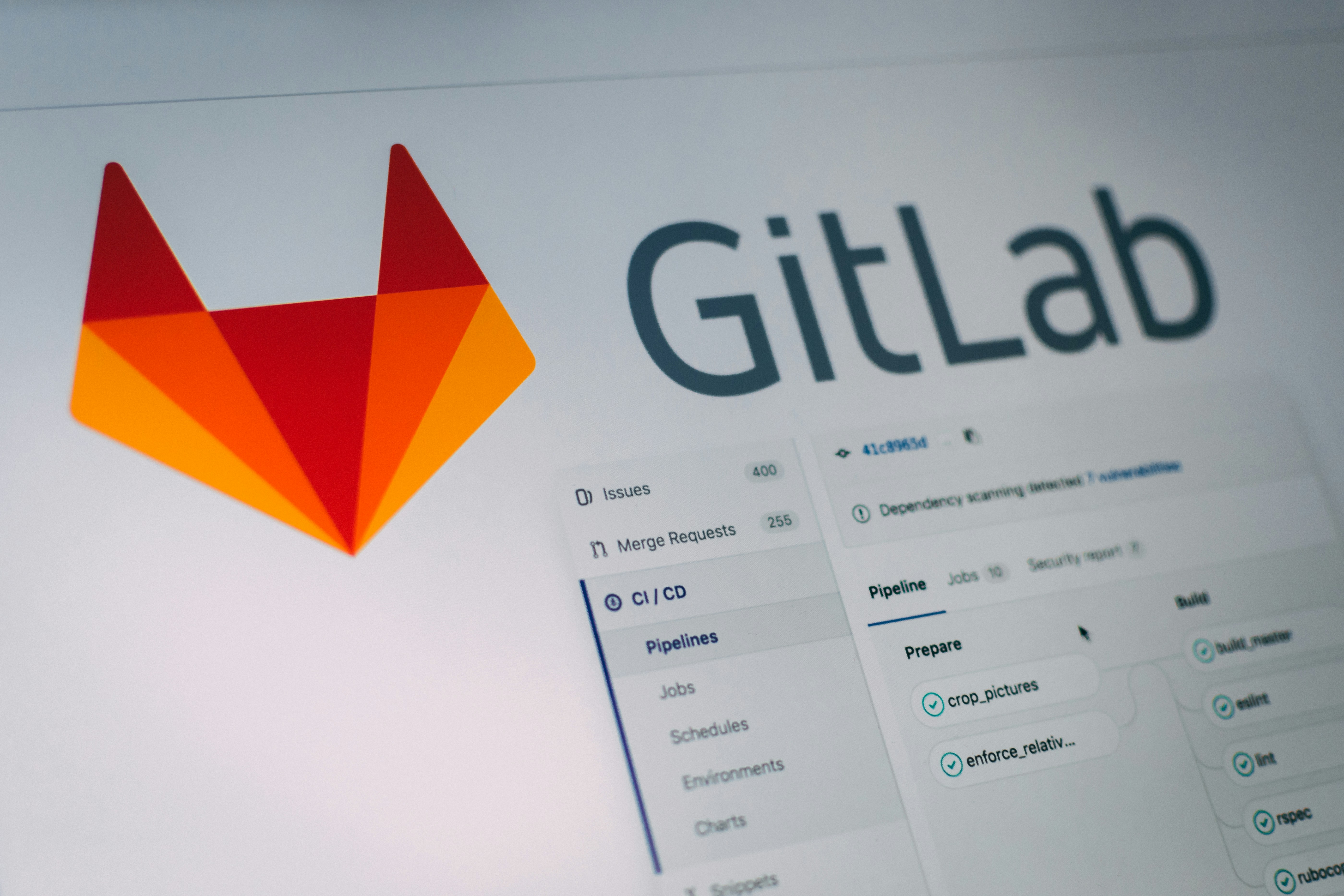
Unlock deeper insights: Introducing GitLab event integration with Mezmo
Unlock deeper insights: Introducing GitLab event integration with Mezmo
Ingest GitLab events into Mezmo to boost observability, trigger alerts, and correlate code changes with system performance. Easy setup with flexible routing.
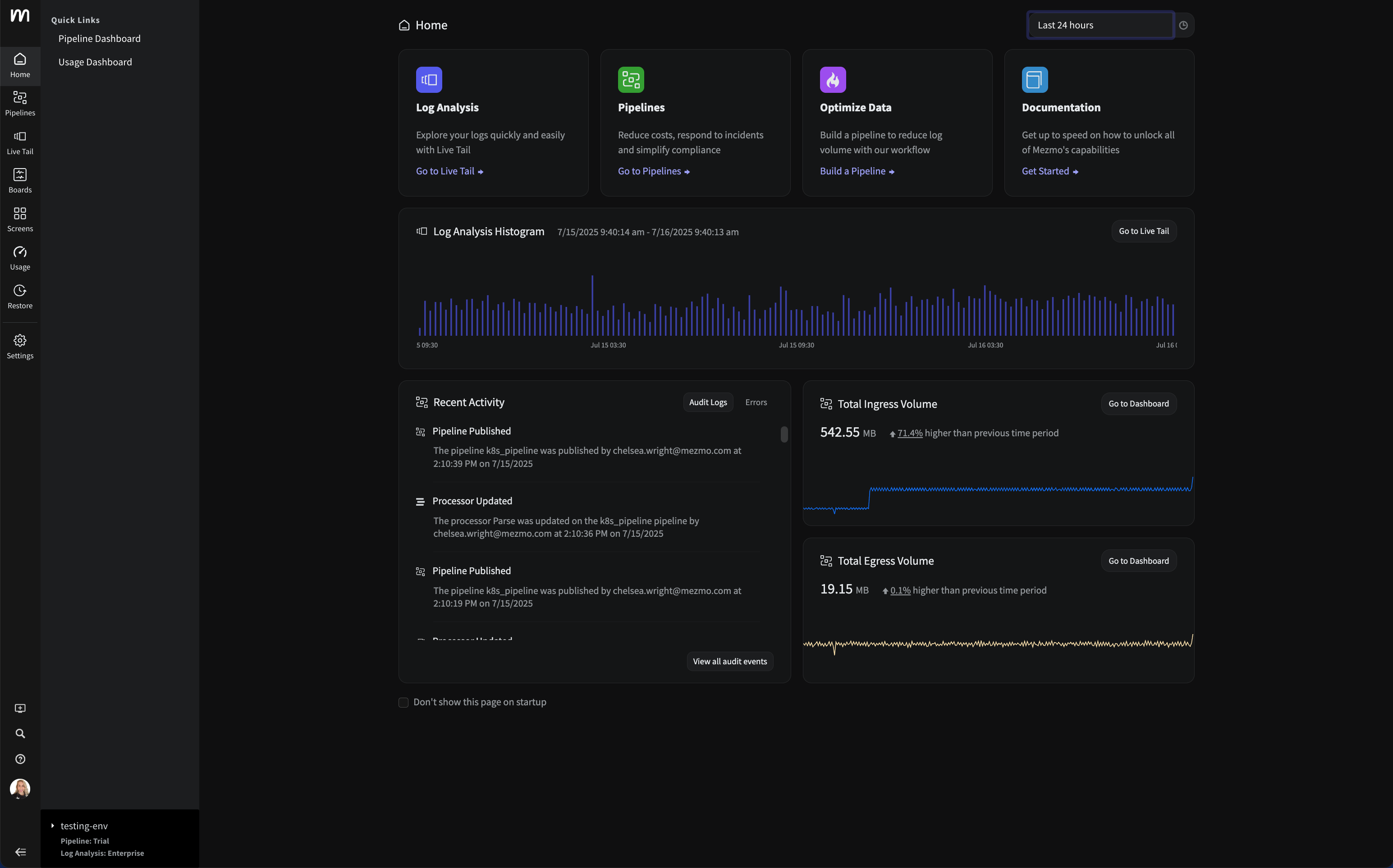
Introducing the new Mezmo product homepage
Introducing the new Mezmo product homepage
Discover Mezmo’s redesigned product homepage with real-time data views, faster navigation, and quick access to Pipelines, Log Views, and system trends.
The inconvenient truth about AI ethics in observability
The inconvenient truth about AI ethics in observability
Your AI is only as ethical as your data. Learn why messy telemetry creates bias, and how to build trust with transparency, security, and human oversight.

Observability's Moneyball moment: How AI is changing the game (not ending it)
Observability's Moneyball moment: How AI is changing the game (not ending it)
Observability is evolving, not ending. Learn how AI-first pipelines cut costs, speed insights, and transform ops into a strategic advantage.

Top five reasons telemetry pipelines should be on every engineer’s radar
Top five reasons telemetry pipelines should be on every engineer’s radar
From cost control to real-time insights, telemetry pipelines help engineers cut noise, enrich data, and build smarter observability into every tool.

Is it a cup or a pot? Helping you pinpoint the problem—and sleep through the night
Is it a cup or a pot? Helping you pinpoint the problem—and sleep through the night
Mezmo filters noise, enriches logs, and pinpoints root causes fast—so you can resolve incidents quickly and avoid sleepless nights.

Smarter telemetry pipelines: Control costs, reduce noise, and get ready for agentic operations
Smarter telemetry pipelines: Control costs, reduce noise, and get ready for agentic operations
Observability costs start upstream in your pipeline. Learn how smarter telemetry pipelines cut data volume and noise, and ready you for agentic ops.

Telemetry for modern apps: Reducing MTTR with smarter signals
Telemetry for modern apps: Reducing MTTR with smarter signals
Why modern telemetry stacks miss the mark on MTTR, and how smarter signals plus synthetic monitoring help teams detect, debug, and resolve faster.

Transforming observability: Simpler, smarter, and more affordable data control
Transforming observability: Simpler, smarter, and more affordable data control
Mezmo’s new pricing model simplifies observability, reduces costs, and gives teams full control over how they process, analyze, and retain telemetry data.

Datadog: The Good, The Bad, The Costly
Datadog: The Good, The Bad, The Costly
Struggling with rising Datadog costs? Learn smart Datadog cost optimization strategies to reduce log ingestion and keep value high without vendor lock-in.

Mezmo Recognized with 25 G2 Awards for Spring 2025
Mezmo Recognized with 25 G2 Awards for Spring 2025
G2 recognized Mezmo with 25 badges across Enterprise Monitoring, Log Monitoring, Log Analysis, and Cloud Infrastructure Monitoring for Spring 2025.

Reducing Telemetry Toil with Rapid Pipelining
Reducing Telemetry Toil with Rapid Pipelining
Telemetry toil and data overload slow teams down. Learn why rapid pipelining and early data processing outperform retention policies for observability.

Cut Costs, Not Insights: A Practical Guide to Telemetry Data Optimization
Cut Costs, Not Insights: A Practical Guide to Telemetry Data Optimization
Drowning in telemetry data and cost? Learn practical ways to optimize telemetry data so you maximize insights without blowing your budget.

Webinar Recap: Telemetry Pipeline 101
Webinar Recap: Telemetry Pipeline 101
Telemetry Pipeline 101: what makes a good pipeline, why it matters for DevOps, and how it cuts data bloat so you get insight without the budget burn.

My Favorite Observability and DevOps Articles of 2024
My Favorite Observability and DevOps Articles of 2024
Five observability and DevOps articles from 2024 worth your time, covering generative AI, telemetry pipelines, and the trends shaping engineering.

How Mezmo Uses a Telemetry Pipeline to Handle Metrics, Part II
How Mezmo Uses a Telemetry Pipeline to Handle Metrics, Part II
Discover how Mezmo scaled its telemetry pipeline to manage 600–700 MB/s of metrics, resolving Kafka partitioning issues for enhanced observability.

Webinar Recap: 2024 DORA Report: Accelerate State of DevOps
Webinar Recap: 2024 DORA Report: Accelerate State of DevOps
Key takeaways from our 2024 DORA Report webinar: what the Accelerate State of DevOps research reveals about AI, delivery, and team performance.

Announcing Mezmo Flow: Build a Telemetry Pipeline in 15 minutes
Announcing Mezmo Flow: Build a Telemetry Pipeline in 15 minutes
Discover Mezmo Flow: the fast, efficient way to build a telemetry pipeline in just 15 minutes. Simplify data flow, enhance observability, and boost performance.

Key Takeaways from the 2024 DORA Report
Key Takeaways from the 2024 DORA Report
Explore the 2024 DORA Report's insights on DevOps performance metrics and the nuanced impact of AI on software delivery.

Webinar Recap | Telemetry Data Management: Tales from the Trenches
Webinar Recap | Telemetry Data Management: Tales from the Trenches
Explore practical strategies for managing complex telemetry data and building robust pipelines from Mezmo and DZone experts.

What are SLOs/SLIs/SLAs?
What are SLOs/SLIs/SLAs?
Learn the differences between SLOs, SLAs, and SLIs, and how Mezmo helps optimize system performance for reliability, compliance, and operational success.

Webinar Recap | Next Gen Log Management: Maximize Log Value with Telemetry Pipelines
Webinar Recap | Next Gen Log Management: Maximize Log Value with Telemetry Pipelines
Learn how telemetry pipelines optimize log data, reduce noise, manage costs, and enhance real-time alerting for effective log management.

Creating Re-Usable Components for Telemetry Pipelines
Creating Re-Usable Components for Telemetry Pipelines
Learn how Mezmo's Shared Sources and Processor Modules streamline telemetry pipeline creation, promoting reusability and centralized data governance.

Optimizing Data for Service Management Objective Monitoring
Optimizing Data for Service Management Objective Monitoring
Learn how Mezmo's telemetry pipeline enhances SLO monitoring by optimizing SLIs for tools like Nobl9, Grafana, and Datadog.

More Value From Your Logs: Next Generation Log Management from Mezmo
More Value From Your Logs: Next Generation Log Management from Mezmo
Discover how Mezmo's next-gen log management solutions help unlock more value from your logs, enhancing observability and driving smarter business decisions.

Dogfooding at Mezmo: How we used telemetry pipeline to reduce data volume
Dogfooding at Mezmo: How we used telemetry pipeline to reduce data volume
Discover how Mezmo utilized its own Telemetry Pipeline to significantly reduce data volume, optimize performance, and achieve cost savings.

Unlocking Business Insights with Telemetry Pipelines
Unlocking Business Insights with Telemetry Pipelines
Unlock business insights with telemetry pipelines. Streamline data collection, transformation, and analysis to enhance performance and improve user experience.

Why Your Telemetry (Observability) Pipelines Need to be Responsive
Why Your Telemetry (Observability) Pipelines Need to be Responsive
Responsive telemetry pipelines maximize data value by understanding, optimizing, and responding to change. Here's why responsiveness matters most.

How Data Profiling Can Reduce Burnout
How Data Profiling Can Reduce Burnout
Learn how data profiling can combat burnout by streamlining telemetry data analysis, reduce mental toil, and focus on critical projects.

Data Optimization Technique: Route Data to Specialized Processing Chains
Data Optimization Technique: Route Data to Specialized Processing Chains
Discover how to optimize data by routing it to specialized processing chains. Learn techniques to enhance efficiency and performance in your data systems.

Data Privacy Takeaways from Gartner Security & Risk Summit
Data Privacy Takeaways from Gartner Security & Risk Summit
Discover key data privacy insights from the Gartner Security & Risk Summit to enhance your organization's security measures.

Mastering Telemetry Pipelines: Driving Compliance and Data Optimization
Mastering Telemetry Pipelines: Driving Compliance and Data Optimization
Discover the benefits of telemetry pipelines for data control and compliance, with expert insights from Michael Fratto of S&P Global Market Intelligence.

A Recap of Gartner Security and Risk Summit: GenAI, Augmented Cybersecurity, Burnout
A Recap of Gartner Security and Risk Summit: GenAI, Augmented Cybersecurity, Burnout
Discover key takeaways from Gartner Security and Risk Summit 2024: AI in cybersecurity, staff shortages, resilience, and privacy.

Why Telemetry Pipelines Should Be A Part Of Your Compliance Strategy
Why Telemetry Pipelines Should Be A Part Of Your Compliance Strategy
Regulatory fines reached $10.5bn in 2023. Explore how telemetry pipelines provide visibility, control & compliance for sensitive data with Mezmo’s solutions.

Pipeline Module: Event to Metric
Pipeline Module: Event to Metric
Transform telemetry with Mezmo's Event-to-Metric module: convert high-volume log events into lightweight metrics inside your pipeline architecture.

Telemetry Data Compliance Module
Telemetry Data Compliance Module
An illustration of the typical configuration of a Compliance module for encrypting and redacting Personally Identifying Information (PII).

OpenTelemetry: The Key To Unified Telemetry Data
OpenTelemetry: The Key To Unified Telemetry Data
Unlock the full potential of OpenTelemetry (OTel) with Mezmo by simplifying Telemetry data collection and enhanced system monitoring.

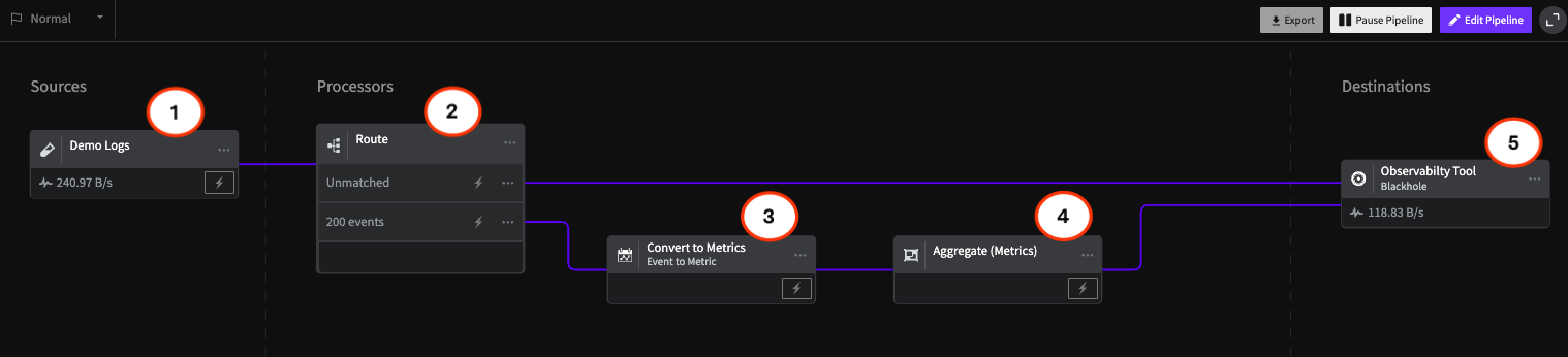
Data optimization technique: convert events to metrics
Data optimization technique: convert events to metrics
A data optimization technique: use the Event-to-Metric module to convert log events into metrics and reduce telemetry data volume by as much as 50%.
What’s New With Mezmo: In-stream Alerting
What’s New With Mezmo: In-stream Alerting
Learn more about Mezmo's product addition of real-time alerting on data in emotion and how it makes Mezmo stand out from the crowd.

How Mezmo Used Telemetry Pipeline to Handle Metrics
How Mezmo Used Telemetry Pipeline to Handle Metrics
How the Mezmo platform team uses the Mezmo Telemetry Pipeline to handle metrics, including the current setup with Sysdig and the plan for what's next.

Webinar Recap: Mastering Telemetry Pipelines - A DevOps Lifecycle Approach to Data Management
Webinar Recap: Mastering Telemetry Pipelines - A DevOps Lifecycle Approach to Data Management
Explore a DevOps approach to telemetry data: understand origins, optimize for cost, and respond effectively to incidents with real-time data.

Open-source Telemetry Pipelines: An Overview
Open-source Telemetry Pipelines: An Overview
Learn more about open-source telemetry pipeline solutions, their common use cases, and how Mezmo’s offering stands out from the crowd.

SRECon Recap: Product Reliability, Burn Out, and more
SRECon Recap: Product Reliability, Burn Out, and more
A recap of SRECon: product reliability at Google Maps scale, meeting burnout, 20 years of SRE, and why telemetry data has to be valuable to matter.

Webinar Recap: How to Manage Telemetry Data with Confidence
Webinar Recap: How to Manage Telemetry Data with Confidence
Learn techniques to build trust in telemetry data using data profiling, optimizing volume, ensuring compliance, and routing data effectively.

Webinar Recap: Myths and Realities in Telemetry Data Handling
Webinar Recap: Myths and Realities in Telemetry Data Handling
Debunk common myths in telemetry data handling and discover strategies to improve data quality, compliance, and business insights.

Using Vector to Build a Telemetry Pipeline Solution
Using Vector to Build a Telemetry Pipeline Solution
Discover how Mezmo leverages Vector's capabilities to enhance telemetry data management, ensuring efficient data collection and actionable insights.

Managing Telemetry Data Overflow in Kubernetes with Resource Quotas and Limits
Managing Telemetry Data Overflow in Kubernetes with Resource Quotas and Limits
Learn how to overcome the challenges of telemetry in Kubernetes by implementing resource quotas and limits to streamline data management and processing.

How To Optimize Telemetry Pipelines For Better Observability and Security
How To Optimize Telemetry Pipelines For Better Observability and Security
In a recent EM360 conversation, Mezmo CEO Tucker Callaway discussed how organizations can optimize telemetry pipelines to enhance security and observability.

Gartner IOCS Conference Recap: Monitoring and Observing Environments with Telemetry Pipelines
Gartner IOCS Conference Recap: Monitoring and Observing Environments with Telemetry Pipelines
Mezmo attended the Gartner IOCS Conference, where telemetry pipelines and observability led the agenda. Here are the takeaways worth knowing.

Webinar Recap: Best Practices for Observability Pipelines
Webinar Recap: Best Practices for Observability Pipelines
In this webinar, 451 Research analyst Mike Fratto highlights some of the best practices for utilizing an observability pipeline to get the best ROI.

Introducing Responsive Pipelines from Mezmo
Introducing Responsive Pipelines from Mezmo
Incidents don't wait. With Mezmo Responsive Pipelines, SREs can pre-configure a pipeline to respond automatically the moment an incident strikes.

My First KubeCon - Tales of the K8’s community, DE&I, sustainability, and OTel
My First KubeCon - Tales of the K8’s community, DE&I, sustainability, and OTel
Mezmo's April Yep recaps her first KubeCon, breaking down the Kubernetes community, DE&I, sustainability, and OpenTelemetry from a packed few days.

Modernize Telemetry Pipeline Management with Mezmo Pipeline as Code
Modernize Telemetry Pipeline Management with Mezmo Pipeline as Code
Pipeline as Code can help transform pipeline management and ensure a streamlined data operation. See how Mezmo Pipeline as Code can help your business.

Kubernetes Telemetry Data Optimization in Five Steps with Mezmo
Kubernetes Telemetry Data Optimization in Five Steps with Mezmo
Optimizing Kubernetes data is essential in order to efficiently manage deployments and gain valuable insights from your data.

Introducing Mezmo Edge: A Secure Approach To Telemetry Data
Introducing Mezmo Edge: A Secure Approach To Telemetry Data
For teams working with sensitive medical or financial data, Mezmo Edge processes telemetry in your own environment to meet PCI, GDPR, and CCPA needs.

Understand Kubernetes Telemetry Data Immediately With Mezmo’s Welcome Pipeline
Understand Kubernetes Telemetry Data Immediately With Mezmo’s Welcome Pipeline
Our new Welcome Pipeline enables you to harness the raw power of Kubernetes data, delivering fast and actionable insights without the complexities.

Unearthing Gold: Deriving Metrics from Logs with Mezmo Telemetry Pipeline
Unearthing Gold: Deriving Metrics from Logs with Mezmo Telemetry Pipeline
Separate signal from noise: learn how to derive valuable metrics from logs with the Mezmo Telemetry Pipeline for clearer, data-driven decisions.
Webinar Recap: The Single Pane of Glass Myth
Webinar Recap: The Single Pane of Glass Myth
The answer to viewing and understanding expanding data sources doesn't come in a single-pane-of-glass solution, explains Mezmo and Intellyx.
Empower Observability Engineers: Enhance Engineering With Mezmo
Empower Observability Engineers: Enhance Engineering With Mezmo
Gain an in-depth understanding of how Mezmo helps empower observability engineers to tackle today's data management challenges.

Webinar Recap: How to Get More Out of Your Log Data
Webinar Recap: How to Get More Out of Your Log Data
Turn a flood of log data into actionable insight. This Mezmo webinar shares the tools and best practices to get more value from your logs.
Unraveling the Log Data Explosion: New Market Research Shows Trends and Challenges
Unraveling the Log Data Explosion: New Market Research Shows Trends and Challenges
As organizations face a log data explosion, the value of that data must grow too. See the drivers behind the surge and how pipelines extract value.
Webinar Recap: Unlocking the Full Value of Telemetry Data
Webinar Recap: Unlocking the Full Value of Telemetry Data
Mezmo and DevOps.com joined together to discuss how to unlock the full potential and value of telemetry data via addressing growing data volume and complexity.